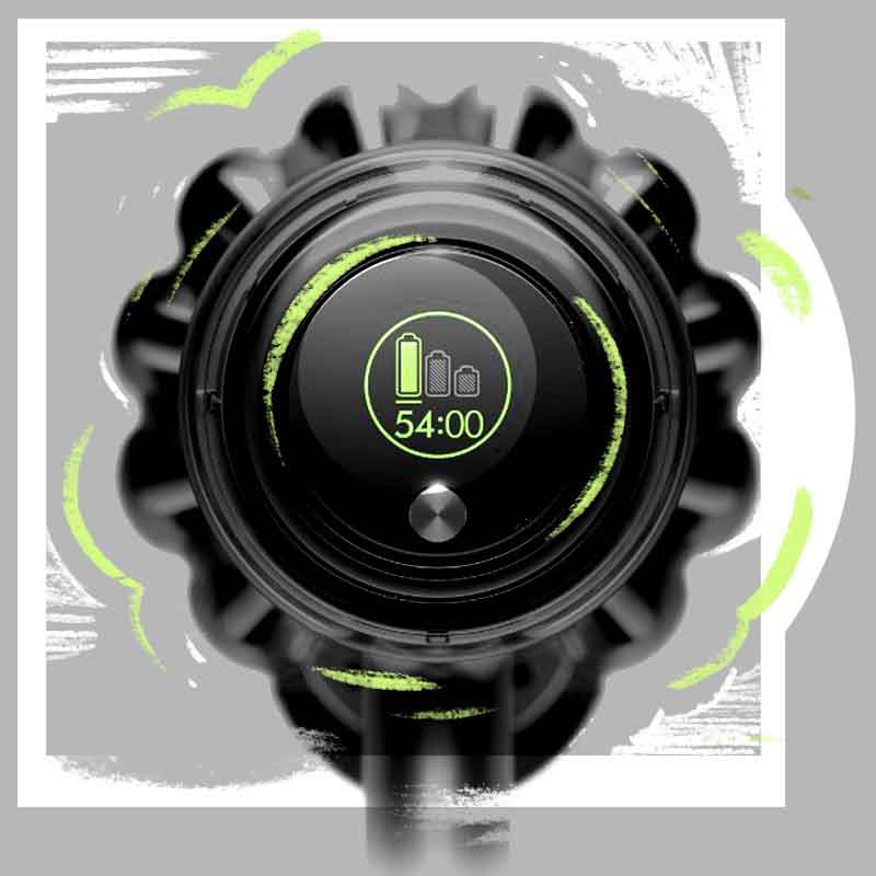
Dyson V11 UI
2017 - 2018


Hypothesis
People don’t believe that battery powered vacuum cleaners can be their only vacuum. Giving them more information on the battery state would lead to better interactions and more sales.
Result
The product was a success with higher satisfaction ratings and more sales
Process
I led the Human Machine Interaction team at Dyson where we were exploring how a screen could go onto a battery powered vacuum cleaner. Initially there wasn’t an obvious utility to that from a user perspective. We started talking about it with others though and it was clear a number of other teams were trying to work out how to better communicate the battery state to a user, either to help preserve the battery for longer, or to remove purchasing anxiety. That coalesced around the idea of being able to communicate to the user how much time their vacuum would last in various power modes.
The idea of runtime was easy to talk about, and from the first trials it was immediately obvious that it was clearly useful to users. But it was hard to execute. As designers we needed to build trust between the user and the machine. If the machine was saying there was 5 minutes left that needed to be true. That required lots of design and exploration to happen around message hierarchy, how faults could be communicated and how uncertainty could be communicated by the machine without causing confusion. All of that needed to happen both within the limitations of the hardware and the timelines for the product to hit market.
Beyond practical design execution our key role as a team was designing the process that allowed the vision to get to market through a team of teams. We had to champion and defend the design through the life-cycle of the product from conception, to manufacturing and marketing. This wasn’t the first Dyson product with a screen but it was the most complex and most high profile. My team was a very small wheel within a much larger organisation and it would have been easy for the experience to have been removed. Sticking to the vision and getting that to market was the biggest design success for the team.
Team
Kristian King (HMI designer), Tom Ridley (HMI designer), Adam Bates (Design director), Harry Hextall (Video designer), Andy Holden (Creative director), Ruth Niven (visual designer), Jason Barstow (developer), Nathan Lawson Mclean (Product designer)
Tools
Pen and paper, Sketch, Framer, After Effects, Photoshop, Processing, JavaScript
Technology
Proprietary Dyson hardware Experience delivered with 128 x 128px screen and single tac-switch Prototyping through an assortment of Arduinos, Raspberry PIs, speakers and screens to mimic a vacuum cleaner