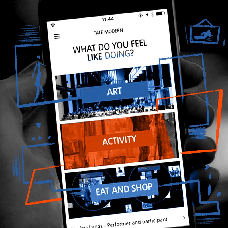
Tate visitor app
2016 - 2017


Hypothesis
People would spend more time, and visit more frequently, if they could use their own device to navigate Tate galleries as well as planning their visit in advance.
Result
Success
Process
Tate, Tate Modern, Tate Liverpool and Tate St Ives had for many years, very successfully, helped visitors navigate galleries with a combination of headphones for hire and maps. They had observed that this favoured power users and excluded lots of their more casual visitors. The visitor app was built to reduce the friction of getting information about the galleries and their works to users.
The in-house team at Tate had spent a lot of time doing some incredible work on their content creating a rich hierarchical relationship between visual, audio and textual information. A lot of the responsibility we had as a product team was to not mess that up. There’s always a danger as a new product team to challenge and change things because of a bias towards action. We had to take the time to understand how the galleries structured their information and how best to deliver that through the app.
A key barrier to the project was poor internet connectivity in the galleries. Especially in Tate Britain connections had high latency and low speeds. We leaned heavily on caching - as much as we could within copyright restrictions - and optimisation. A lot of time was spent in the galleries testing performance.
As part of the project Tate introduced a network of Bluetooth beacons through the galleries. This enabled us to know where the user was both vertically and horizontally within a gallery giving us the ability to give room-by-room contextual information.
We explored using additional technology to augment these Bluetooth beacons to better triangulate the user’s location within a gallery. As a product team we wanted a seamless experience where a user could move through the gallery and the app would know exactly what painting they were looking at, or passing by, to give them the most relevant information. We had a working prototype but it was - unfortunately - prohibitive from a cost perspective.
Team
Stephen Waller, Sam Smith, Martin Allison, Toby Hammond, Danny Milsom, Pablo Recio Quijano
Tools
Pen and paper, whiteboards, Sketch, Photoshop, Google Docs, Google Sheets
Technology
Swift iOS app Java Android app Django-based API exposing Drupal CMS content